Does Crime Actually Lower Home Prices? We Checked 688 Counties
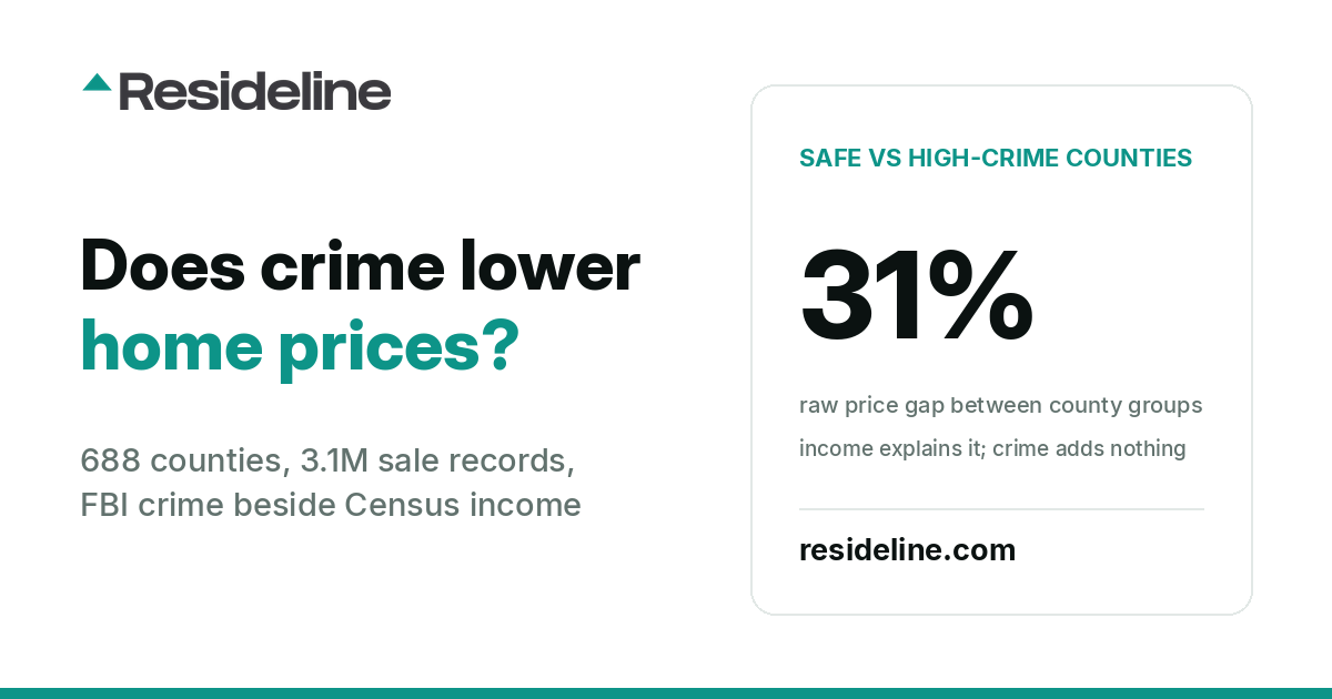
The safest quarter of US counties has a median closed price 31 percent higher than the highest-crime quarter, and earns 33 percent more. Hold income and density constant and a county's crime rate adds nothing measurable. 688 counties, 3.1 million sale records.
Ask any buyer what a high crime rate does to house prices and you will get the same answer. The raw data agrees with them, right up until you hold anything else constant.
We matched FBI crime figures for 688 US counties against 3.1 million home sale records from the last 12 months, plus Census income and education for every county. The counties cover 201 million people across forty-five states. Every price and rent figure below is a true median taken over the sales and listings themselves, and every crime figure is a county rate built only from the police agencies that actually reported, over the months they reported.
The same crime data ranked state by state, with prices and rents beside each county where we track them, is in Safest Counties by State.
One thing to hold onto before the numbers: this is a county-level comparison. Studies that work at the scale of a census tract, a ZIP code or a block, where one side of a neighborhood can be far more dangerous than the other, consistently find that violent crime does lower nearby home values, typically by a few percent for every ten percent more crime. Those effects are real and this study does not test them. What it tests is the claim people actually make when they compare counties: that a county with a higher crime rate has cheaper homes because of the crime.
The comparison everyone publishes
Sort the counties by violent crime and compare the safest quarter against the highest-crime quarter, and the gap is exactly what you would expect.
| Measure | Safest quarter | Highest-crime quarter |
|---|---|---|
| Violent offenses per 100,000 | 105 | 486 |
| Median closed price | $359,500 | $274,250 |
| Median asking rent | $1,900 | $1,535 |
| Median household income | $89,743 | $67,319 |
| Adults with a bachelor's degree or higher | 35% | 28% |
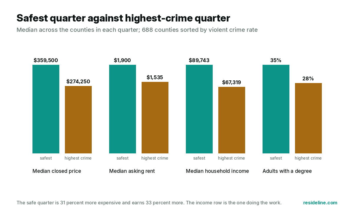
A 31 percent price gap. Case closed, except for the income row. The safe counties also earn 33 percent more, and most of the price gap is sitting on top of that income gap. Rents show the same shape, 24 percent higher in the safe quarter.
Inside one state, the discount looks real
Comparing Mississippi counties with Connecticut counties tells you about Mississippi and Connecticut, so the next test compares each county only against the others in its own state. In the twenty-five states with at least 12 measurable counties, the highest-crime third of counties is 24 percent cheaper than the safest third in the median state, and twenty-four of the twenty-five run in that direction.
The income gap travels with it. In Illinois the safest third of counties has a median household income of $105,431 against $65,021 in the highest-crime third.
What happens when you hold income constant
Put income, education, density and both crime rates into one model of county home prices and you can see which of them is carrying the result. Every input is standardized, so the effects are directly comparable.
| What predicts a county's median home price | Standardized coefficient | 95 percent interval |
|---|---|---|
| Median household income | +0.261 | +0.224 to +0.299 |
| Share of adults with a bachelor's degree or higher | +0.082 | +0.046 to +0.114 |
| Population density | -0.035 | -0.078 to +0.007 |
| Violent crime rate | +0.013 | -0.023 to +0.052 |
| Property crime rate | +0.020 | -0.020 to +0.059 |
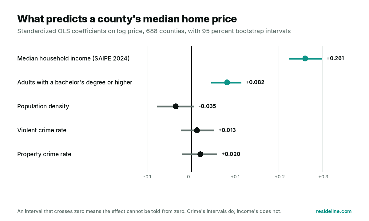
The model explains 56 percent of the variation in county prices, and income does the work. A one standard deviation rise in violent crime (200 offenses per 100,000) moves the expected price by +1.3 percent, with a 95 percent interval from -2.3 to +5.3 percent, which is a range that comfortably includes zero. Measured on a log scale instead, the coefficient is +0.074: positive, because crime tracks urban and urban is expensive. In no version of this model, with or without state effects, does a higher county crime rate go with significantly lower prices once income is in it.
Every county on one chart
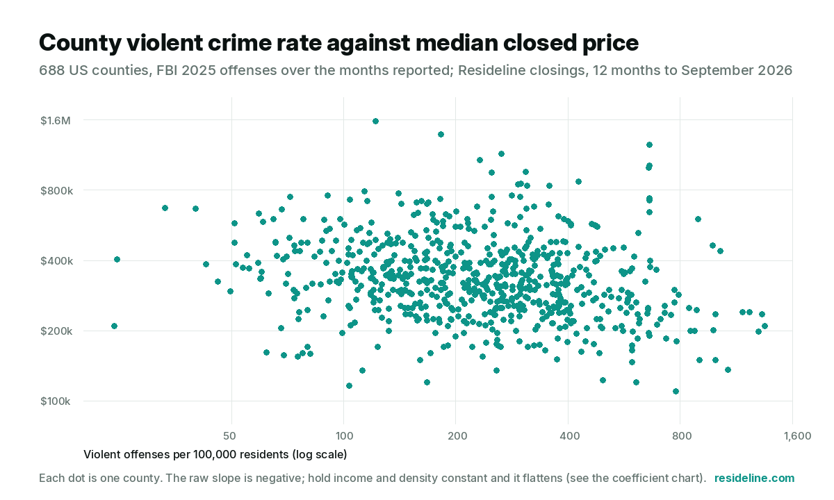
The raw slope runs downhill: higher crime, lower prices. It is the income gradient you are seeing. The table above is what remains once income, education and density are in the model.
Nine groups, no pattern
Split the counties into thirds by income, then thirds again by density, and only then compare high crime against low crime inside each of those nine groups. If crime discounted homes on its own, every group would lean the same way.
It does not. Across all nine groups, the gap between the highest-crime and the safest counties runs from 15 percent cheaper to 28 percent more expensive, and the high-crime counties are the more expensive ones in 7 of the 9 groups. None of the nine gaps is statistically distinguishable from zero. Once two counties earn alike and are built alike, their crime rates add no measurable information about what their houses cost.
Put plainly: the county-level discount is real in the raw numbers. Once income and other county characteristics are controlled for, crime adds no measurable predictive power to county-level home prices. That does not make crime harmless to home values. It means a county's crime rate is mostly a marker of its income, and the two cannot be separated at this scale.
Where it does show up: gross yield
For an investor the question is different. Gross yield is twelve months of asking rent over the closed price, and it moves opposite to price: cheap counties carry higher gross yields whatever their crime rate, because rents fall less than prices do. Inside each income third, here is the median gross yield of the safest third of counties beside the highest-crime third.
| Income third | Counties | Yield, safest third | Yield, highest-crime third | Difference |
|---|---|---|---|---|
| Lowest | 225 | 6.57% | 7.25% | +0.68 pts |
| Middle | 225 | 5.95% | 5.97% | +0.01 pts |
| Highest | 226 | 5.81% | 5.59% | -0.22 pts |
What this means if you are buying
A county crime rate tells you something about what homes cost there, but only because it tells you about the county's income. Two counties with the same income and the same density show no consistent price difference by crime rate. The rate is still worth knowing, because it describes the place you would live in, but a county-wide figure is not a discount you can bank on or a premium you are obliged to pay. Within a county, the block matters: the research at neighborhood scale finds that violent crime does lower the value of the homes nearest to it.
For a landlord the cheap end of the market does show a little more gross yield where crime is higher. The premium is small, it appears only in lower-income counties, it is mostly the arithmetic of low prices, and gross yield counts none of the vacancy, turnover or repair costs a landlord actually pays.
How this was built
Crime: FBI Crime Data Explorer, 2025, county level. Each rate divides the offenses the reporting agencies filed by the population those agencies serve, capped at the county population. Agencies that filed nothing, or filed one category and not the other, are excluded from both the numerator and the coverage figure. An agency serving several counties is placed by its own coordinates. A county is measured only when its agencies report on at least 90 percent of its population, it has at least 50,000 residents and at least 250 tracked closings, and its rates fall inside plausible bounds.
Prices and rents: the median over the closings and rental listings Resideline tracked in each county over the 12 months to September 2026. Income: Census SAIPE 2024 county median household income. Education: the share of adults 25 and over with a bachelor's degree or higher from the Census ACS 2020 to 2024 five-year estimates, at the county level. Density: Census 2024 population over 2024 land area. An agency that reported only part of 2025 is rated over the months it reported, and a county is included only when its reporting agencies cover at least 90 percent of its residents for the year. Counties left out for that reason include San Diego (CA), Suffolk (NY), Orange (FL), Denton (TX), Lee (FL), Brevard (FL), Monmouth (NJ), Clark (WA).
Every figure on this page is a county-wide figure. The spread inside a county is often wider than the spread between counties, so none of this describes a street or a neighborhood. The neighborhood-scale research we defer to includes Ihlanfeldt and Mayock (Miami-Dade census tracts), Pope and Pope (urban ZIP codes across the country) and Linden and Rockoff (block-level effects), all of which find that violent crime lowers nearby home values.
Technical notes
Sample: the 688 counties whose reporting agencies cover at least 90 percent of their residents for the year, with at least 50,000 residents, at least 250 tracked closings and rates inside sanity bounds (violent 20 to 1,500, property 100 to 6,000 per 100,000). Partial-year reporting: an agency whose monthly series shows a run of three or more zero months beside real counts is rated over the months it reported, and its population counts toward coverage in proportion. Dependent variable: the natural log of the county's true median closed price over the closings themselves. Predictors, each standardized to mean zero and standard deviation one across the sample: log of SAIPE 2024 median household income, the share of adults 25 and over with a bachelor's degree or higher (ACS 2020 to 2024 five-year), log of people per square mile (Census 2024 population over 2024 land area), the violent crime rate and the property crime rate. Estimator: ordinary least squares with a constant, unweighted, no fixed effects in the printed model. Intervals: percentile bootstrap over 1,000 county resamples. Robustness: with state fixed effects (every variable demeaned within its state) the violent coefficient is -0.015; with the violent rate in logs it is +0.074. The matched comparison splits the sample into income thirds, then density thirds, and compares the safest third with the highest-crime third inside each of the nine cells (76 to 78 counties per cell). The yield table uses gross yield, twelve months of median asking rent over the median closed price, on the 676 counties with a rent median and a yield between 2 and 12 percent.
Sources
- •Crime: FBI Crime Data Explorer, agency-level monthly offense counts for 2025.
- •Income: Census Small Area Income and Poverty Estimates, 2024.
- •Education and land area: Census American Community Survey 2020 to 2024 five-year estimates (table B15003) and the 2024 Gazetteer; population: Census county estimates, vintage 2024.
- •Prices and rents: Resideline's tracked closings and rental listings, 12 months to September 2026.
- •Research: Ihlanfeldt and Mayock, Panel data estimates of the effects of different types of crime on housing prices, Regional Science and Urban Economics, 2010; Pope and Pope, Crime and property values: evidence from the 1990s crime drop, Regional Science and Urban Economics, 2012; Linden and Rockoff, Estimates of the impact of crime risk on property values from Megan's Laws, American Economic Review, 2008.
Frequently Asked Questions
Does a high crime rate lower home prices?
At the county level, not once income is accounted for. The safest quarter of US counties has a median closed price 31 percent higher than the highest-crime quarter, and it earns 33 percent more. Hold income, education and density constant and a county's violent crime rate adds nothing measurable. At the scale of a block or a neighborhood the research says otherwise: violent crime does lower the value of the homes nearest to it.
How many counties does this cover?
688 counties in forty-five states, covering about 201 million people and 3.1 million home sale records from the last 12 months. A county is included only when its police agencies report on at least 90 percent of its residents and it has enough tracked closings for a reliable median.
Is this crime rate for my neighborhood?
No. The FBI publishes these figures for whole counties, so every part of a county carries the same number, from its densest district to its farmland. Use it to compare counties, not streets.
Do high-crime counties give investors better gross yields?
Slightly, and only at the cheap end. In the lowest-income third of counties the highest-crime counties show about 0.7 percentage points more gross yield than the safest ones, mostly because their prices are lower. In the middle and highest-income thirds there is no difference outside the noise. Gross yield uses asking rent and ignores vacancy, repairs and turnover.
Which big counties are missing, and why?
A county is included only when its police agencies report on at least 90 percent of its residents for the year and it has enough tracked closings for a reliable median. The largest left out on the crime side are San Diego (CA), Suffolk (NY), Orange (FL), Denton (TX), Lee (FL), Brevard (FL), Monmouth (NJ), Clark (WA). We do not estimate a county we cannot measure.

About the author
Jeffrey Batista
Jeffrey Batista is the founder of Resideline, a real estate technology company building institutional grade valuation and investment analysis tools for real estate investors.
A software engineer with more than 10 years of experience, Jeffrey has worked across full stack development, infrastructure, data engineering, machine learning, and large scale systems. He left his engineering career to build Resideline full time.
Jeffrey is also a real estate investor with nearly a decade of hands on experience buying, renovating, managing, and analyzing residential properties. His experience on both sides of the industry, as an engineer and an investor, led him to build Resideline after seeing how fragmented and outdated many of the tools available to individual investors were.
Today, he leads the development of Resideline's proprietary data infrastructure, automated valuation models, rental analytics, and investment underwriting technology.
Found an area you like? Check the property next.
Create a free account to check property value, rental potential and comps in the area you are researching.
Create a free account3 free reports at signup. No card required.